✦ DURATION – 2025 • Feb - Nov
✦ TEAM – 2 Product Designer • Product Manager • 6 - 7 Engineers
✦ TOOLS – Figma • Notta
U.S. News & World Report serves over 40 million monthly readers who depend on its rankings and advice for major life decisions in education, health, money, and travel. Despite this reach, the brand had no mobile app.
So the goal for this project was two-fold. To build an app that doesn't just mirror the website but offer unique value. And build an MVP that surfaces the same articles and ratings content from US News.
We knew an app couldn’t just be a copy of the website. It had to offer real value — for the company and for readers. Since users already had a mobile-friendly site, our challenge was to define what unique benefits would make the app worth downloading and returning to.
competitor audit
By looking at competitors like , we saw an opportunity. Since readers often come to U.S. News for specific, niche decisions, the app had to help guide those journeys in a more personal and engaging way.
Users needed an easy, accessible way to answer their most pressing questions when it comes rankings and news, the content US News is known for.
Stakeholder interviews
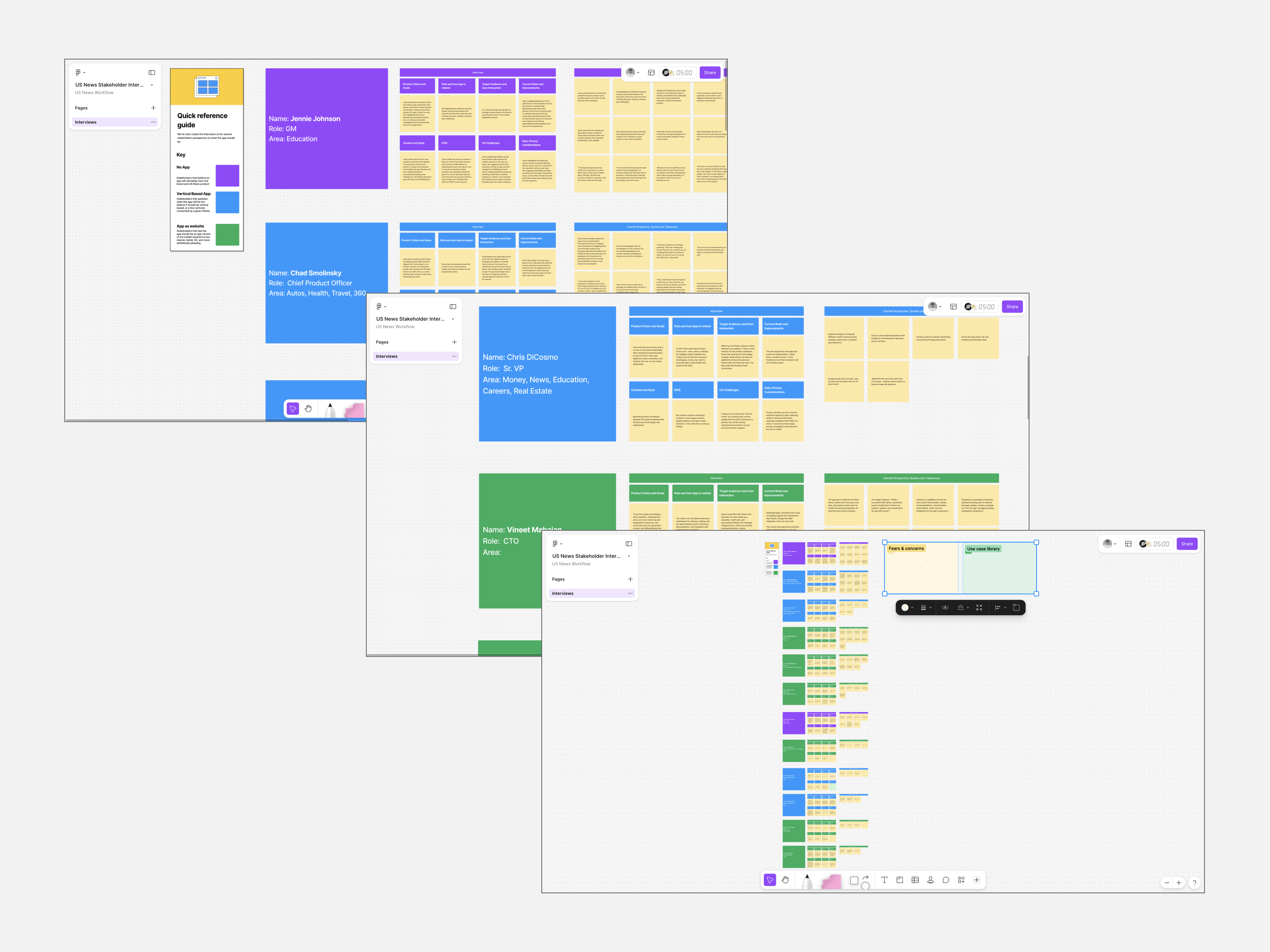
To understand what the company wanted in a mobile app, we conducted numerous stakeholder interviews with people across the organization — from account managers in different verticals to senior leaders, including SVPs and the CTO.
Interestingly enough, we found that the employees at US News fell into three camps:
✦ Vertical Based App: This concept centers around a user answering a brief onboarding quiz that will then generate a personalized feed.
✦ App Mirrors Website: This concept features an AI-based personal assistant that will help you find the right article for the question or challenge you might have in mind.
✦ No App: Surprisingly, some stakeholders believed that having an app that takes away traffic from the website would do more harm than good to the company's brand.
We explored three core concepts, ranging from quick wins to ambitious, blue-sky ideas — each designed to deliver increasing value for both the company and its readers.
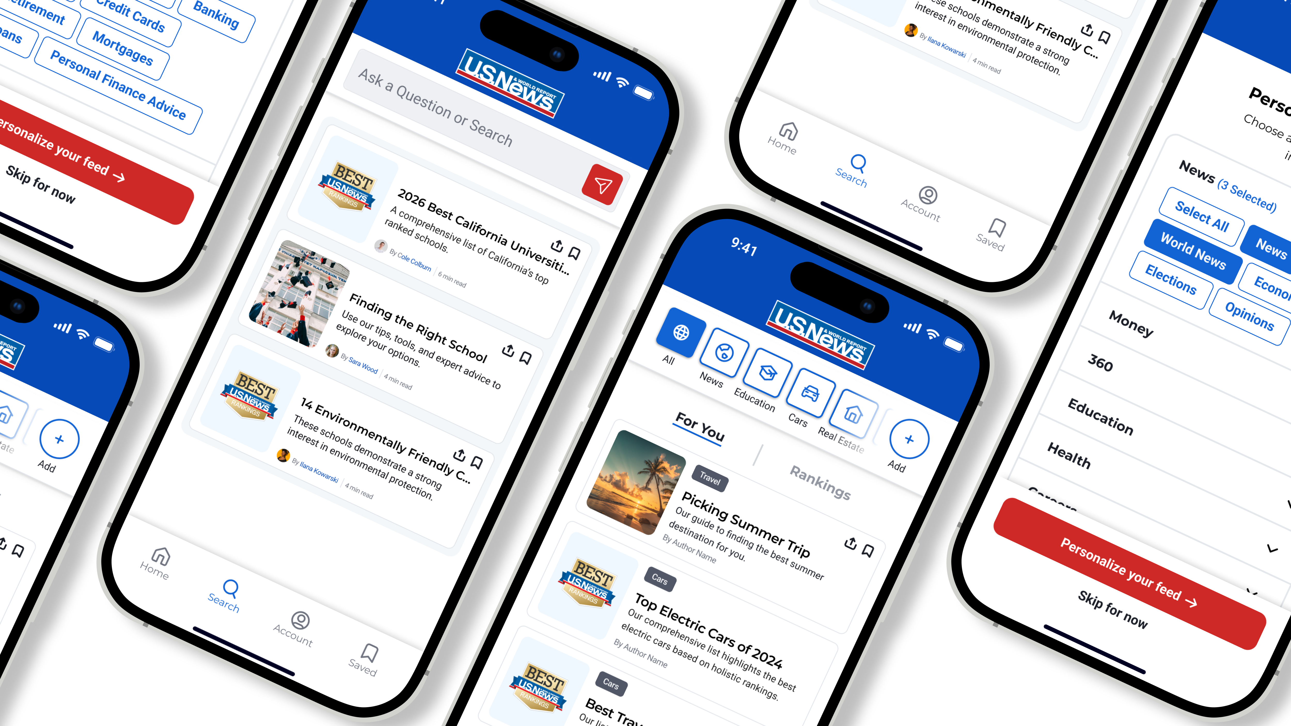
✦ My Feed: This concept centers around a user answering a brief onboarding quiz that will then generate a personalized feed.
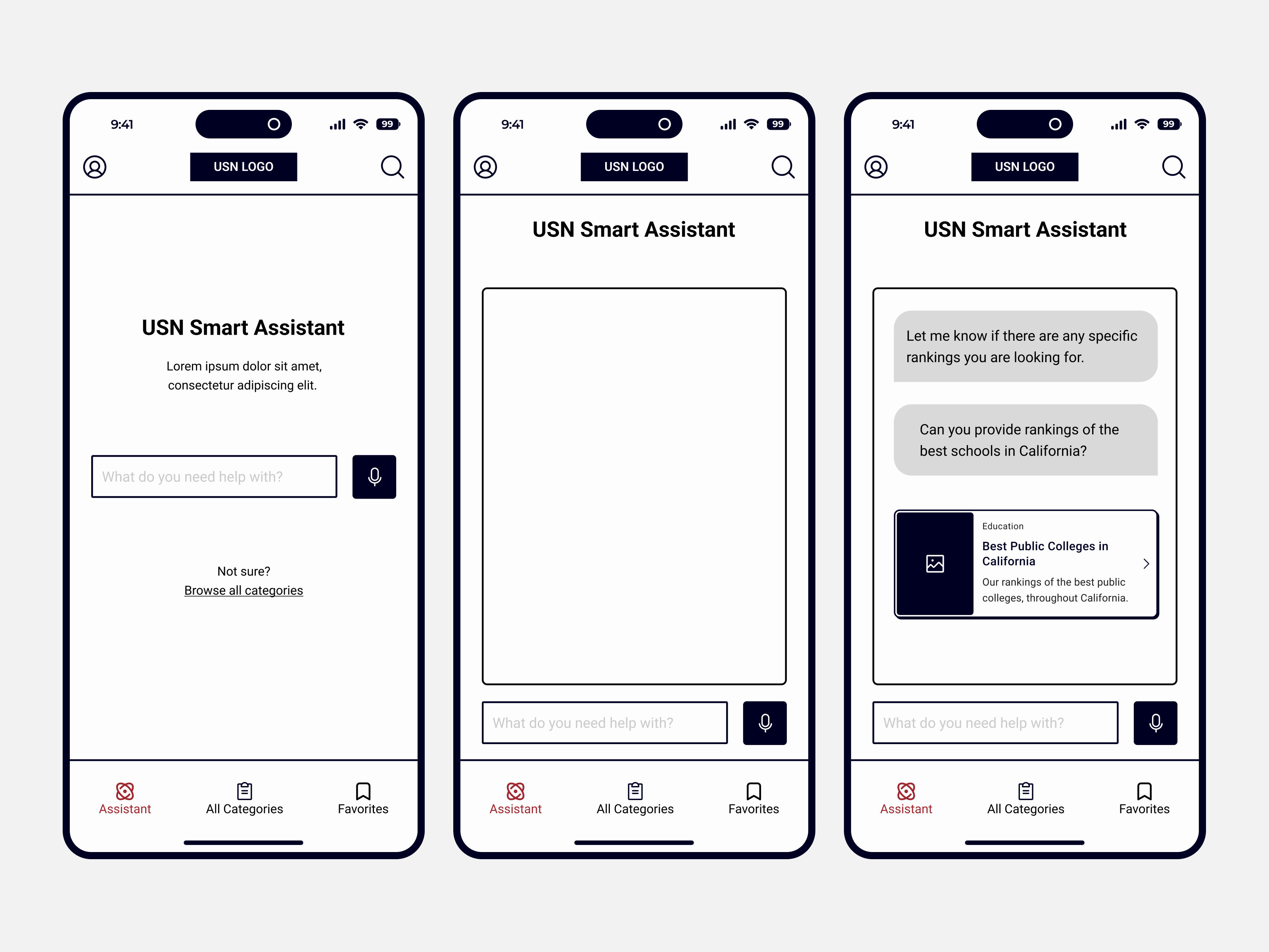
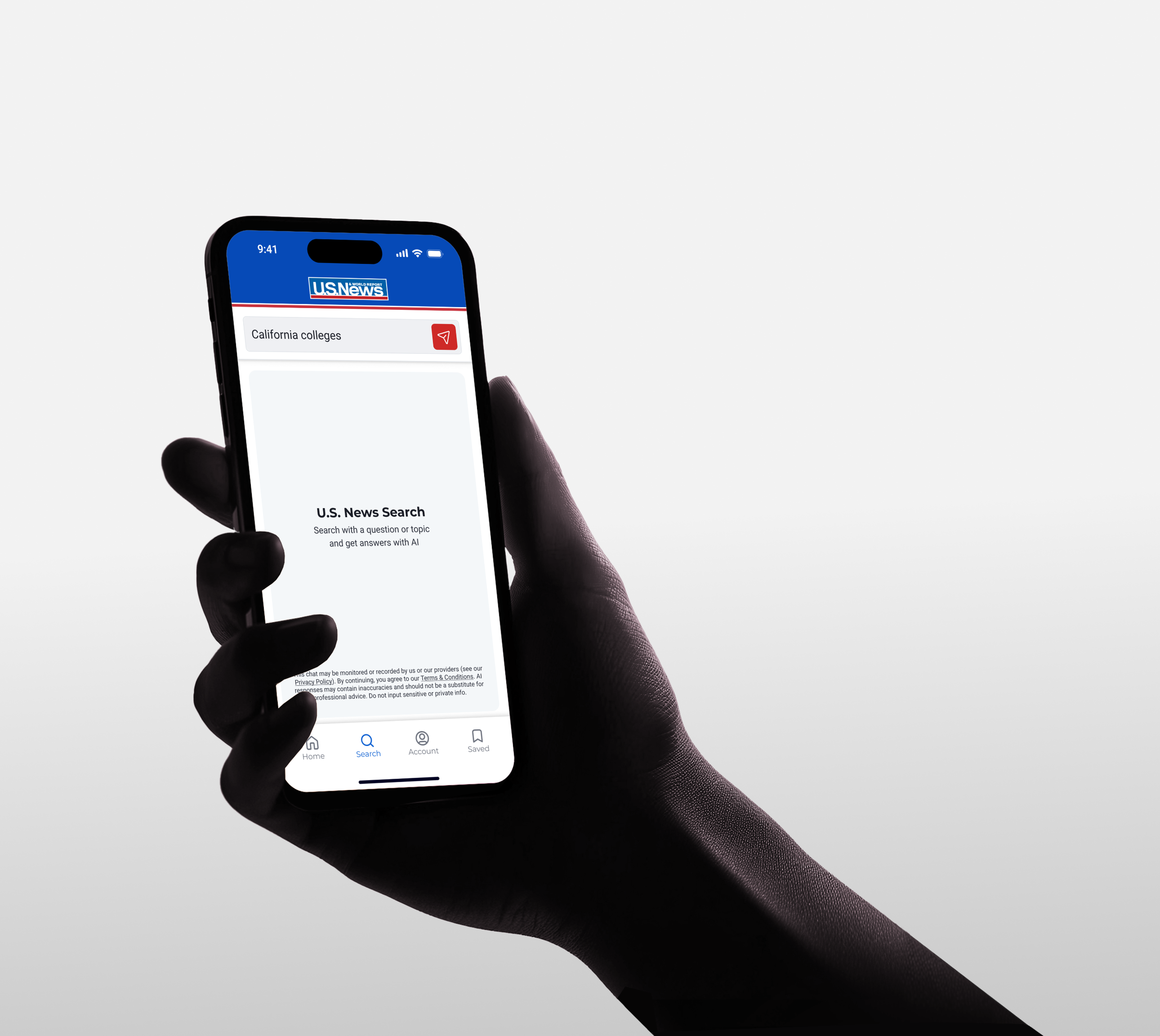
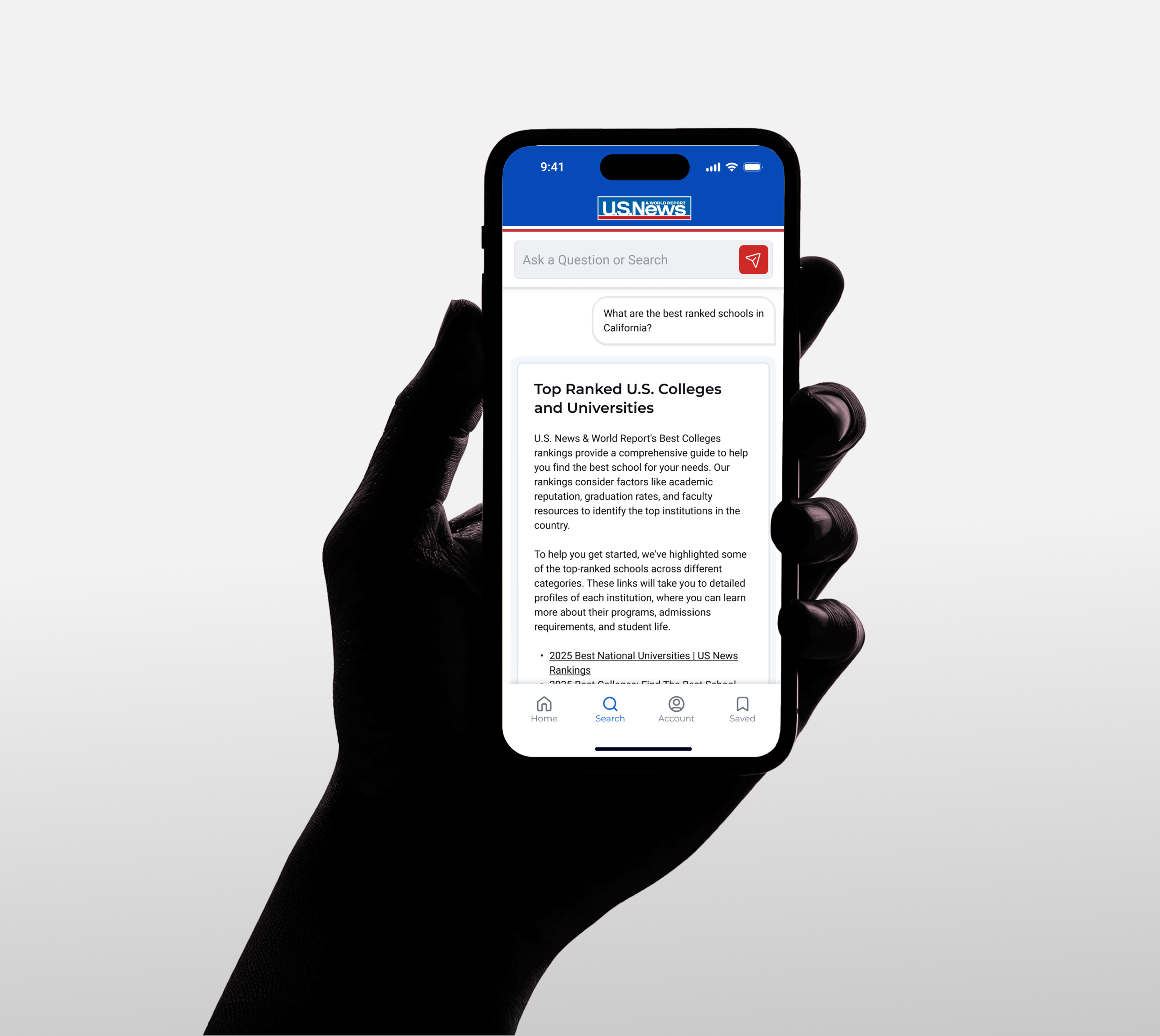
✦ Smart Assistant: This concept features an AI-based personal assistant that will help you find the right article for the question or challenge you might have in mind.
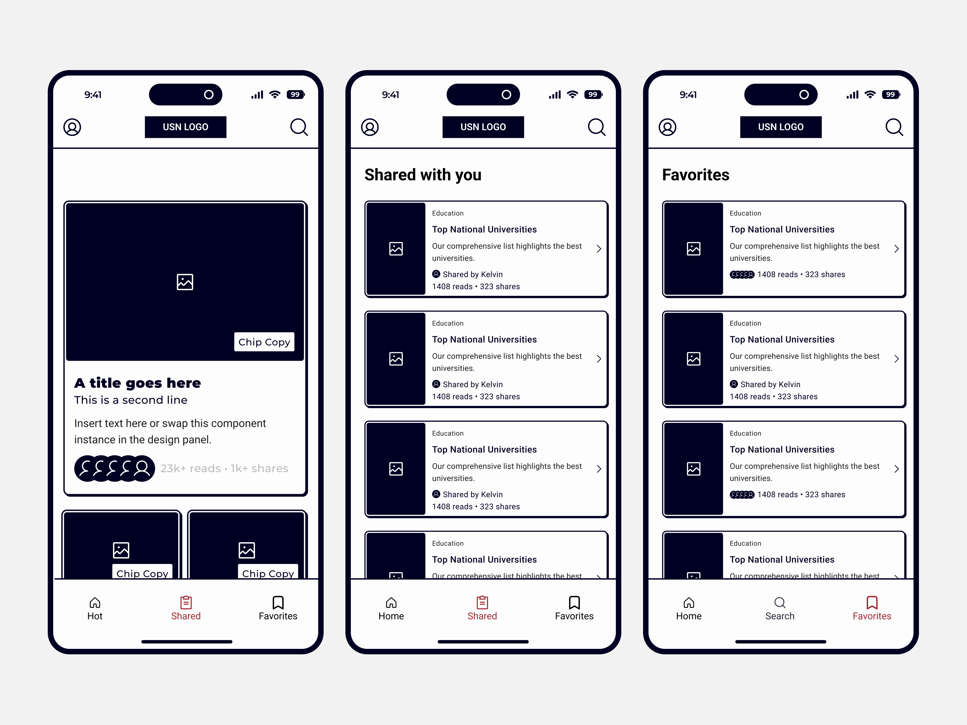
✦ What’s Hot: This concept revolves around social conversation, and highlights topics that are currently trending or top of mind. The designs also incentives users to easily share, comment, and have and active participation.
By using our research on competitors and a feature list we created for the client, we started creating lo-fi screens that incorportated all our thinking and concepts. During this stage, I was able to quickly get the foundation of a component system ready for hi-fi.

"My Feed" Concept

"What's Hot" Concept

"Smart Assistant" Concept

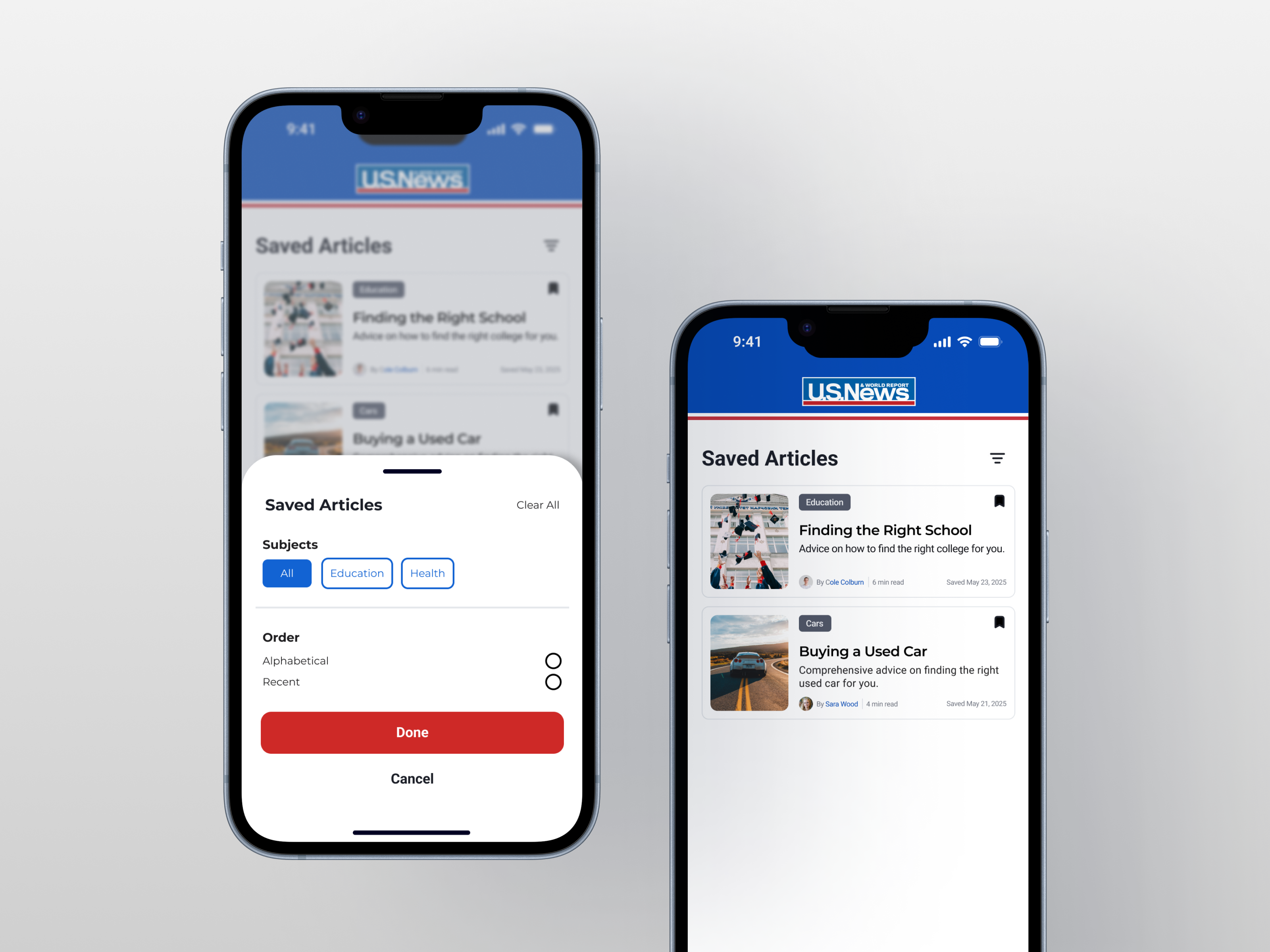
Accounts and Bookmarking Screens
Ultimately, the client chose a hybrid approach — combining “My Feed” with the “Smart Assistant.” We saw this as a smart balance: it preserved the familiarity of the existing web experience while introducing a new, differentiated feature utlizing AI that could motivate users to download and engage with the app.
The client left a raving review for the team with a satisfaction rating of 94%. The app has launched as of November 2025 on both Google and Apple app stores.
Next Project
Verizon Console
